
Digital experience of BNY Mellon
StreamLine is a popular mobile banking app that enables users to manage their accounts, track expenses, and make transactions. The app, however, was facing usability issues that led to a decline in user satisfaction and engagement. Our goal was to redesign the app, improving its UX/UI to provide a seamless, intuitive, and enjoyable experience for users, ultimately increasing user retention and satisfaction.

London, United Kingdom
Investment Banking
5,000+
Role
As a Senior UX Designer at BNY Mellon UK, I led the design of responsive visual interfaces for BNY Mellon UK and Global Market Outlook websites. I managed a multilingual design team and collaborated with stakeholders to establish UX best practices within Agile processes. My contributions spanned project planning, design reviews, and all phases of the product lifecycle.
Challenge
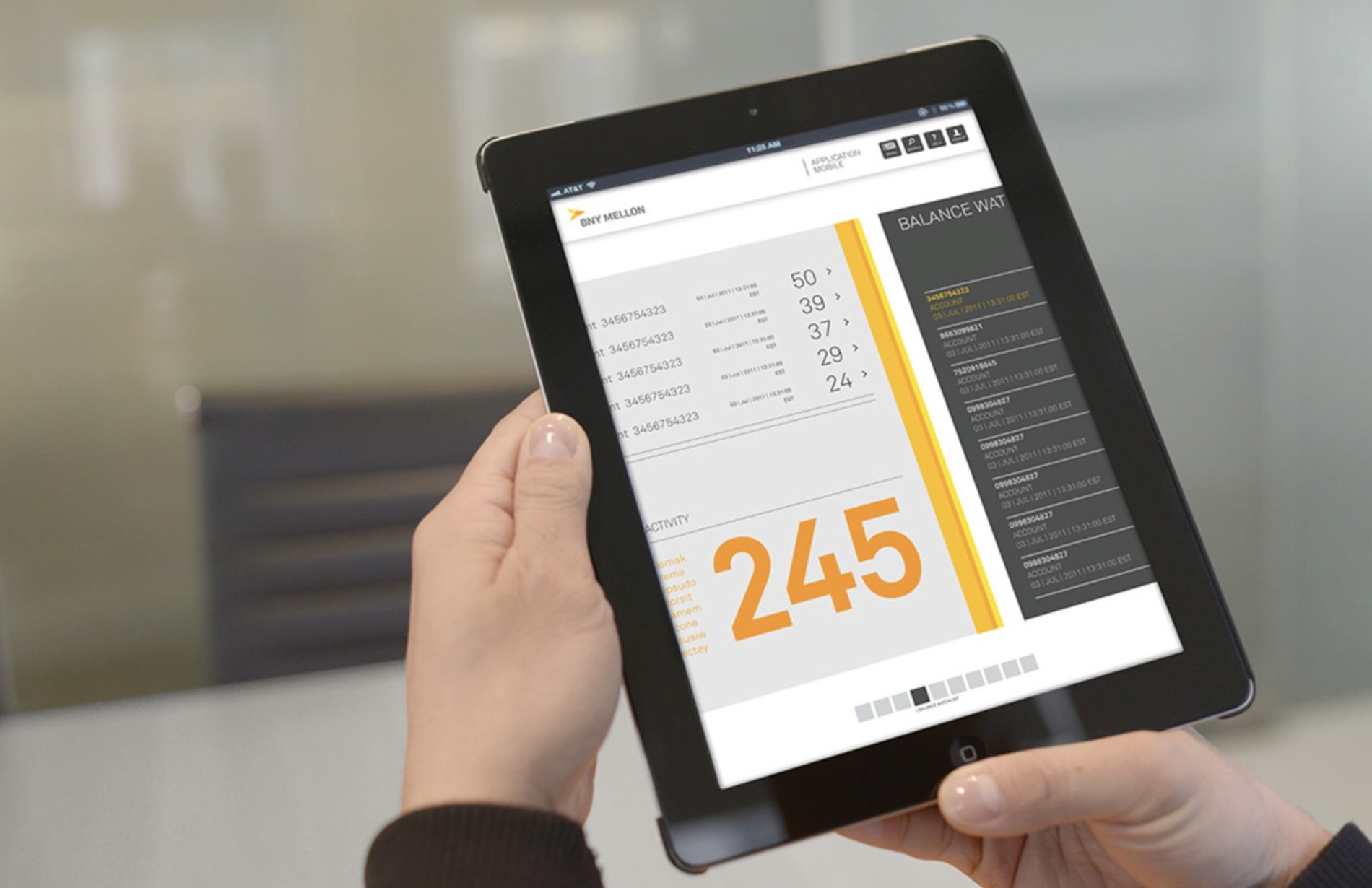
BNY Mellon Investment Management EMEA has seen a 38% increase in digital engagement, distributing over 958,196 client-facing communications this year alone. However, the rapid growth has led to inconsistencies in User experience across the website due to ad-hoc evolution of tools and templates. Additionally, with over 70% of users now accessing digital content via mobile devices, the lack of responsive design in the current templates has resulted in significant accessibility issues and a suboptimal experience for mobile users.
Results
As a result of the comprehensive redesign, BNY Mellon Investment Management EMEA significantly improved the user experience across its digital platforms. The new responsive design ensured seamless accessibility on both desktop and mobile devices, leading to a 25% increase in mobile engagement and a 15% reduction in bounce rates.
The consistency in design and layout across all user touchpoints enhanced brand perception and user satisfaction, ultimately contributing to the continued growth in digital engagement and client interactions.
25%
Increase in mobile engagement
15%
Reduction in bounce rates
64%
Increase in time spent on website

Process
Discover: Sought to understand the core UX challenges faced by BNY Mellon Investment Management EMEA’s users. We conducted stakeholder interviews to align on business goals, analyzed website analytics to identify user behavior patterns, and reviewed competitor websites to benchmark best practices. Additionally, we studied user feedback and industry reports, uncovering that a significant portion of users now access content via mobile devices. This phase provided critical insights into the gaps in the current website’s design and the increasing need for a responsive, user-centered experience.
Research & Analysis: Data gathered in the Discover phase to identify specific user needs and pain points. We developed detailed user personas based on demographic and behavioral insights, highlighting the diverse needs of BNY Mellon’s clients. Journey mapping helped us visualize the user experience across different devices, revealing significant friction points, particularly on mobile. A thorough gap analysis compared the current website’s capabilities with user expectations, underscoring the critical need for a responsive design and consistent user interface across all platforms.
Define: Our research findings to clearly articulate the core UX challenges and establish a focused direction for the redesign. We developed problem statements that addressed the lack of responsive design and inconsistent user experience, which were critical barriers to user satisfaction. Design objectives were set to create a fully responsive website that provided a seamless experience across devices, with an emphasis on consistency in layout and ease of navigation. These objectives were aligned with BNY Mellon’s business goals, ensuring that the redesign would not only improve user engagement but also support the organization’s broader digital strategy.
Information Architecture: Restructured the website’s content and navigation to enhance usability and ensure consistency across all devices. A comprehensive content audit allowed us to prioritize the most critical information, streamlining the user experience. We developed a new sitemap that organized content logically, making it easier for users to find what they need quickly. The redesigned navigation system was simplified and standardized, ensuring that whether users accessed the site via desktop or mobile, they encountered a cohesive and intuitive experience.
Wireframing & Prototyping: Began by creating low-fidelity wireframes to outline the basic layout and structure of the redesigned website. These wireframes helped us visualize the flow and functionality of key pages, ensuring that the new design would be user-centered and intuitive. Through iterative reviews and user feedback, we refined these wireframes, gradually increasing their fidelity. Once the structure was solidified, we developed high-fidelity, interactive prototypes to simulate the final user experience across different devices. These prototypes were essential for usability testing, allowing us to gather real-time feedback and make adjustments before moving into full-scale development.
Usability Testing: We conducted usability tests with a diverse group of users to validate the design and identify areas for improvement. Based on the feedback, we made necessary adjustments to the design.
Visual Design & Solution: We developed a cohesive visual language, including color schemes, typography, and iconography, ensuring consistency throughout the app. We also created a style guide to maintain design consistency in future updates.

“ With our new visual branding and language in place, the new Shopify brand clearly captures the essence of our current and target customer base, our employees, and our values. ”